I'll Show It To You
- Steve
- Oct 7, 2021
- 2 min read
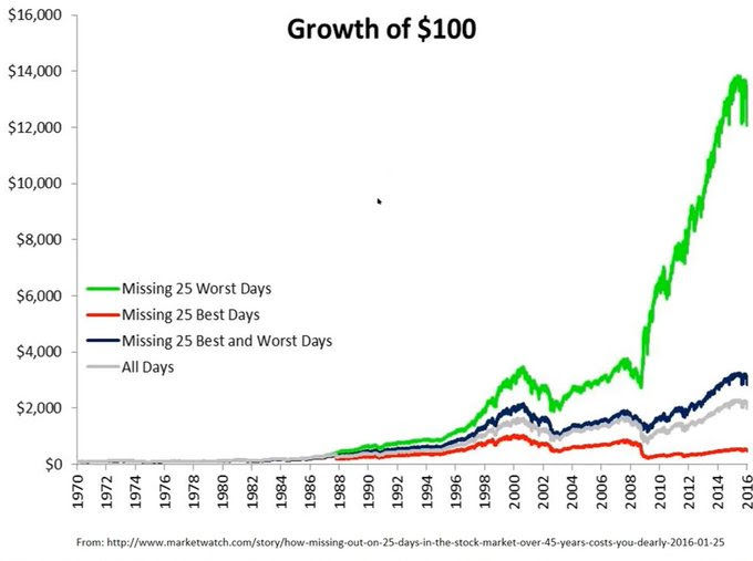
If you haven't already, take a look at the chart above. And then get ready, because I'm going to share something personal. It's one, if not the biggest, investing pet peeve of mine. The gray line in the chart shows the investment growth of $100 from 1970-2016 (sorry, I couldn't find a more recent chart). Now take a look at the red line - that's the growth of that same $100 but subtracts out missing the BEST 25 days of returns over that same time period. It's a chart many financial advisors LOVE to show to clients. "See," they'll tell their clients, "you don't want to pull money out because look what happens when you miss the BEST investment days!" Heck, you can even buy professionally produced charts showing these two lines! But now take a gander at that green line, I know, you've probably already looked at it. And then look at the legend - "Missing 25 WORST Days." Hmmm... Strangely, I've never seen a chart for sale showing that, or the three lines altogether, for sale.
Of course, how can we ever know when the best and worst days will come? The truth is, we can't, at least not for certain. But it stands to reason, based on the chart above, we ought to make at least *some* attempt to better understand when they might, right? After all, the discrepency in those outcomes is not small. Might there be, well, signs? I think there might. "Distributions days," "negative divergences," that sort of thing. And that's why I'm here. To watch for those things. To be sure, not every sign leads to a large wash-out. But taking your foot off the gas when multiple signs line up can be a good way to find a better result. After all, as a small, individual investor, this is one of your main advantages over larger institutions. You (We) can sell off part of a portfolio in seconds, while it takes institutions weeks, if not months. And if we're wrong? We can quickly get re-invested having only missed out on a percent or two. I'll take that advantage all day. And I think you should too.


Comments